A logo with a longer history than the business itself
The look has changed. The reason it exists has not.
Long before there was a charity platform, before there was a payments business, and before Open Banking was even a phrase, there was a logo.
The original Wonderful mark, which many people will recognise from Wonderful.org and Wonderful Payments, was designed by Julie Kwan at Leighton more than twenty-five years ago. It was drawn freehand with a marker pen for an idea to build a fundraising website. This idea eventually made it into the world, just fifteen years later than planned! In the meantime, life and business moved on, and Wonderful sat patiently in the background until the right moment arrived.
That moment came because of something much more personal. My teenage son Daniel decided to raise money for Teenage Cancer Trust by jumping out of an aeroplane. As friends and family donated, all of us became frustrated by how much of that money appeared to “leak” away before it reached the charity. Platform fees, card fees, deductions against Gift Aid and all the other friction that gets normalised in charitable giving had begun to feel absurd.
If somebody gives £10 to charity, should the charity not receive £10?
That question led to the launch of Wonderful.org.
The non-profit was incorporated on my daughter and co-founder Carmen’s birthday, launched on my 50th and supported through corporate sponsorship for its first five years. That reflects the truth about Wonderful: from the beginning, it has been wrapped up in family.
A family business in the most literal sense
Wonderful has never been a family business in the glossy, sentimental sense of the phrase, but in the practical sense: sleeves rolled up, everybody helping, everybody sharing the load.
The frustration that led to Wonderful.org was felt by all of us, but perhaps most viscerally by Daniel. Watching much needed cash evaporate really frustrated him, and I still remember how palpable that was. It was the moment that galvanised us and turned a long-held idea into something we felt compelled to build.
Carmen was there from the beginning as co-founder and has grown with the business every step of the way, from writing blog posts from the back of a truck during a gap year in Costa Rica to becoming our Head of Operations. Carmen’s incredible talent, passion and attention to detail has helped shape not just how Wonderful works, but how it looks and sounds too, right down to selecting the font that now sits at the heart of the new identity.
Daniel first cut his teeth coding for Wonderful at the start of the pandemic and has gone on to become an exceptional developer running his own businesses and building innovative services for a range of clients. From the sidelines, he continues to challenge Wonderful’s thinking about how new technologies should be used in the business, not least AI, and has played an important role in pushing us to think more ambitiously about what comes next.
My middle daughter, Gabi has been an invaluable sounding board for language, tone and much more. Over the years, she has contributed thoughtfully to copy, public relations and marketing creative, often serving as the trusted voice to ensure everything aligns with the essence of Wonderful. And now, unsurprisingly, she is about to be a published author, her first novel will hit the stores soon.
And of course, my wife Elisa: my rock, the glue that holds us all together, the source of unfiltered feedback and the person who has kept me focused through the chaos, pressure and frequent turmoil of startup life
That is why this rebrand feels personal. It is part of a family story, a reflection of the people who have helped shape Wonderful into what it is today.
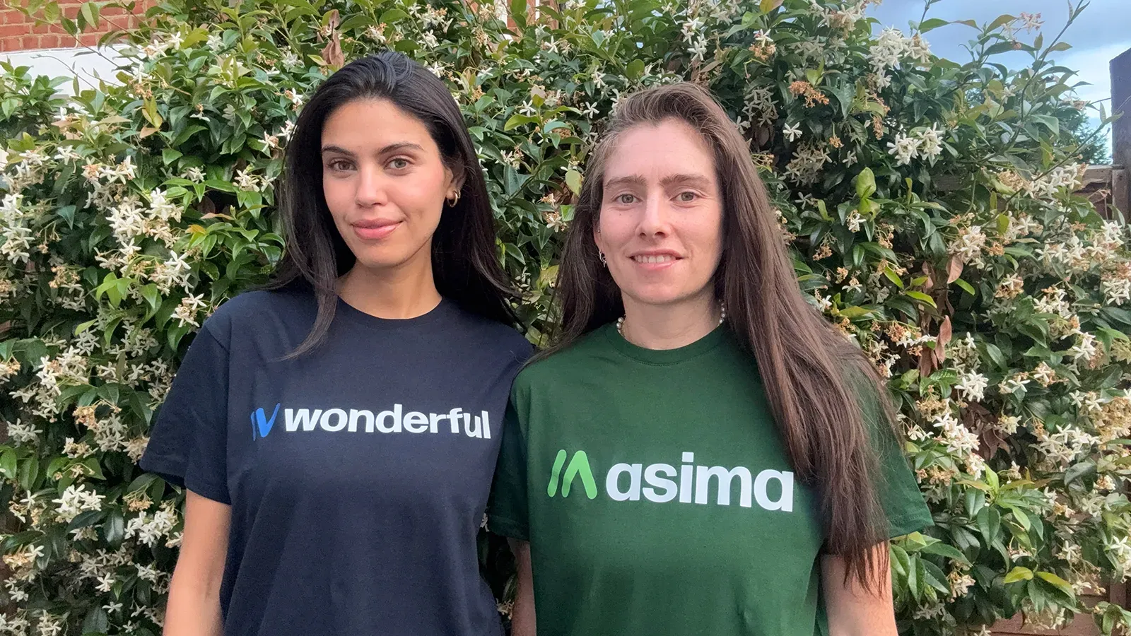
To mark the launch, Carmen and her wife Estefany are sporting the new Wonderful and Asima logos in the photograph accompanying this post. That feels exactly right. This brand has always had real people behind it. It should look like it.
Why refresh the brand now
The old Wonderful logo served us well. It carried us from a fee-free charity fundraising platform into the world of account-to-account payments, and it did so with a warmth and distinctiveness that we all remain very fond of.
But Wonderful has outgrown the visual system around it.
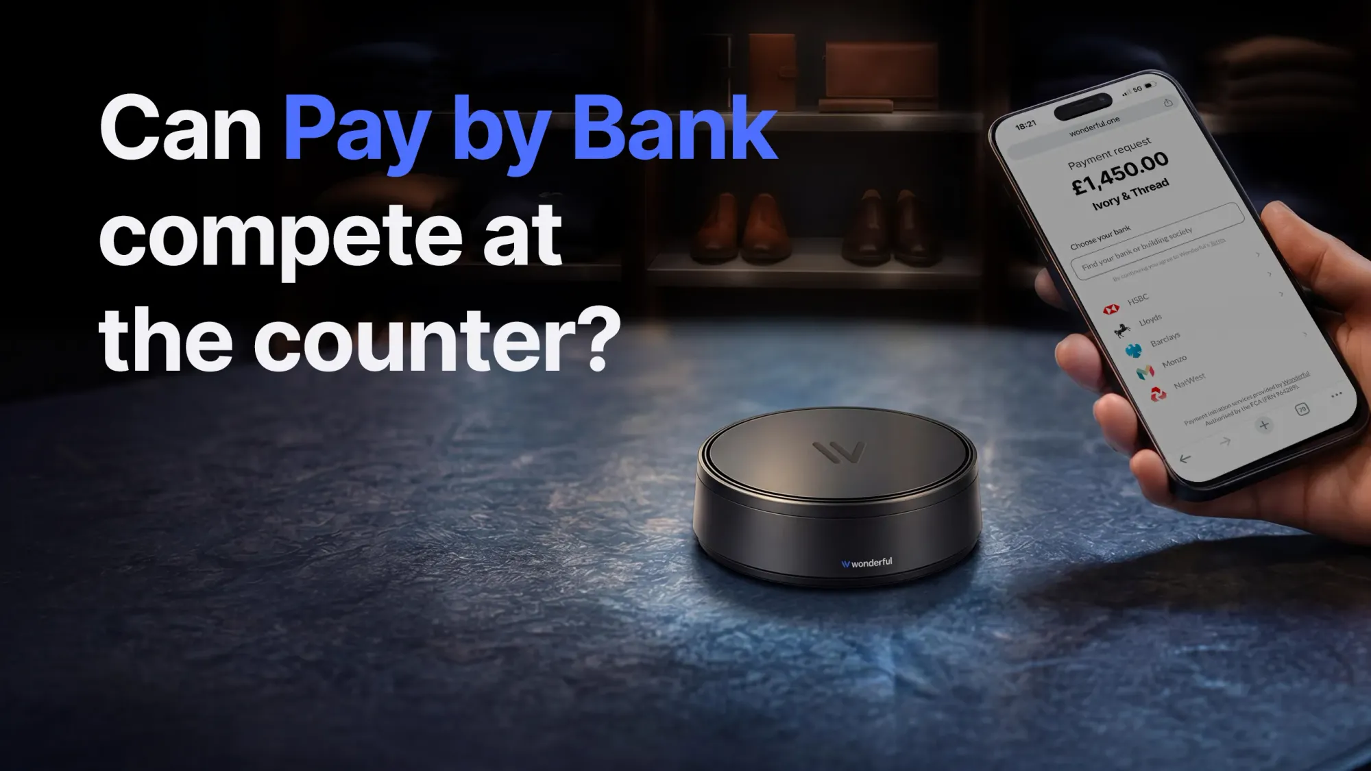
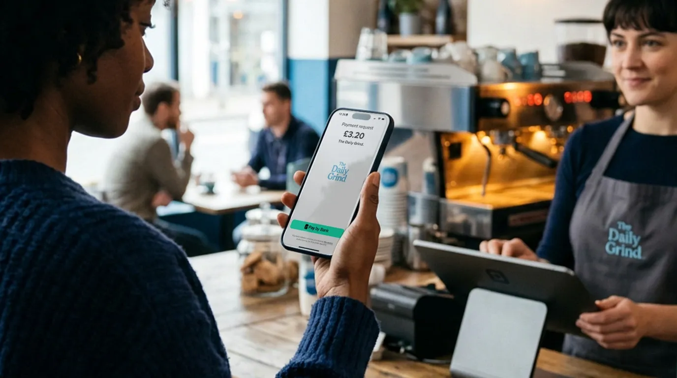
Today, Wonderful is no longer just one thing. Alongside our original charity mission, we now help businesses take Pay by Bank payments in person, online and by invoice. We have built infrastructure, merchant products and payment experiences that are more ambitious, more technically sophisticated and more commercially substantial than anything we imagined when Wonderful.org first launched.
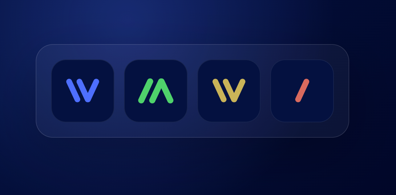
And Wonderful is no longer a single brand. Alongside Wonderful now sit Asima, our infrastructure brand, One, our merchant dashboard and app, and Four, which looks towards the consumer side of the transaction. The refresh needed to do two things at once: modernise Wonderful itself, and create a family of brands that clearly belong together without feeling identical.
How the new brands were developed
The refresh did not begin with a colour palette or a moodboard. It began with the letter W.
Wonderful needed a clean icon that would work properly in the places modern brands live: favicons, app icons, browser tabs, navigation bars, social avatars and digital product interfaces. The old Wonderful logo had history and warmth, but it was designed a decade before the iPhone rather than the kind of modular, digital use now required. So the challenge was to create something simpler and sharper without losing the connection to Wonderful itself.
That first step unlocked the whole family.
As the new W took shape, it became obvious that it also resembled the Roman numeral IV. That became the anchor for the wider system: a shared device that could connect Wonderful and Four, while giving all the brands a recognisable visual language.
From there, the rest followed. A vertical flip of the W gave us the A for Asima, a moment of realisation that genuinely happened on a yoga mat, although I was not upside down at the time! (Note to self: stay present.) One was simpler still. Its purpose is singular: to help merchants and charities get paid, instantly. So its mark was stripped right back to its essence, a single stroke / a forward slash.
Taken together, that became the design principle for the whole refresh.
From a hand-drawn mark to a modern identity system
The original Wonderful logo was created with a marker pen, and that gave it a looseness and individuality that would have been very easy to lose in a refresh.
Rather than trying to recreate that literal hand-drawn aesthetic, we took the spirit of it and translated it into something more precise and adaptable. The new identity is cleaner, sharper and better suited to digital products, websites, devices, documents and app interfaces, but it still aims to feel recognisably ours rather than borrowed from the fintech design shelf.
We were not trying to decorate the business. We were trying to build a system, something that could work across a website, a merchant dashboard, a payment device, a technical page, a blog post and a family of related products.
Huge thanks to a small team
Family has been a huge part of the Wonderful story, but so has a very small but highly committed team.
A handful of people have taken an entirely new brand system from concept to reality across our websites, products and platforms in less than four weeks, while still doing all the day jobs that keep the business moving! That is no small feat.
The rebrand may be the visible part, but the work behind it has been substantial: translating ideas into usable design assets, rebuilding pages, updating interfaces, applying the new system consistently across multiple brands, and doing it all at a pace that would be ambitious even for a much larger company with far more resource.
I am immensely grateful to them. They are a real credit to Wonderful, not just for the speed of the work, but for the care, commitment and resilience they bring to the business more generally.
Looking ahead
Wonderful started with a simple frustration: why does so much donated money fail to reach the charity it was intended for? From there, it became a charity platform, then a payments business, and now a wider family of brands working on different parts of the same problem.
For all the changes in how Wonderful looks, the underlying proposition is the same one that drove us in the first place. We still believe that money should move more directly from one person to another, or from customer to business, with less friction, less cost and less waste. And we still believe that if you can build something simpler, fairer and more transparent, you should.
This refresh is about making that journey visible.
It is a nod to the original Wonderful mark that Julie sketched all those years ago. It is a thank you to the family members who have helped build the business, and to the increible team that has worked so hard to bring the new identity to life so quickly. Above all, it is a statement of intent.